1. Sometimes, visuals can stand alone:

2. Use font sizes to help you make your point:

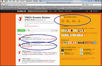
3. Use screen shots and visually focus your audience on key ideas:

4. Use arresting, unusual graphics, not the same old tired clip art:

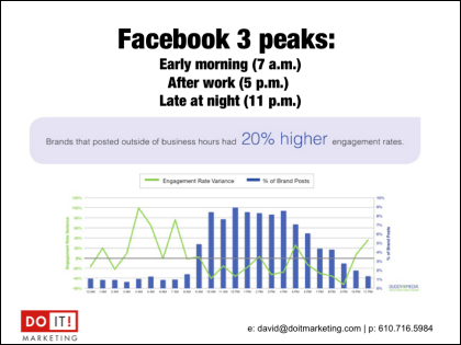
5. It's OK to use graphs if you summarize the A-ha insight they provide:

6. Sometimes it helps to SHOW and TELL on the same slide:

What do YOU think? Please use the COMMENTS area below to share your advice, insights and recommendations on this topic and join the conversation...


